-

New Labels

Whenever faced with a graphic project, the first question to ask is what one wants to say and to whom. So the colours, the graphic representations and the characters of the texts will be studied, created and chosen following a careful analysis, to make them relevant and correlated to the founding message and the cognitive ability of the final user.
A detailed study of the wine market has led us to specialise in the creation of labels, aware of the demand of different markets, of different customers, and of the different sales channels of wines worldwide.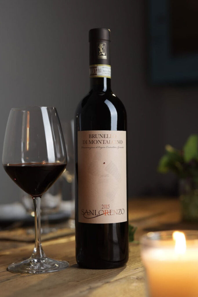
Concept of visual identity
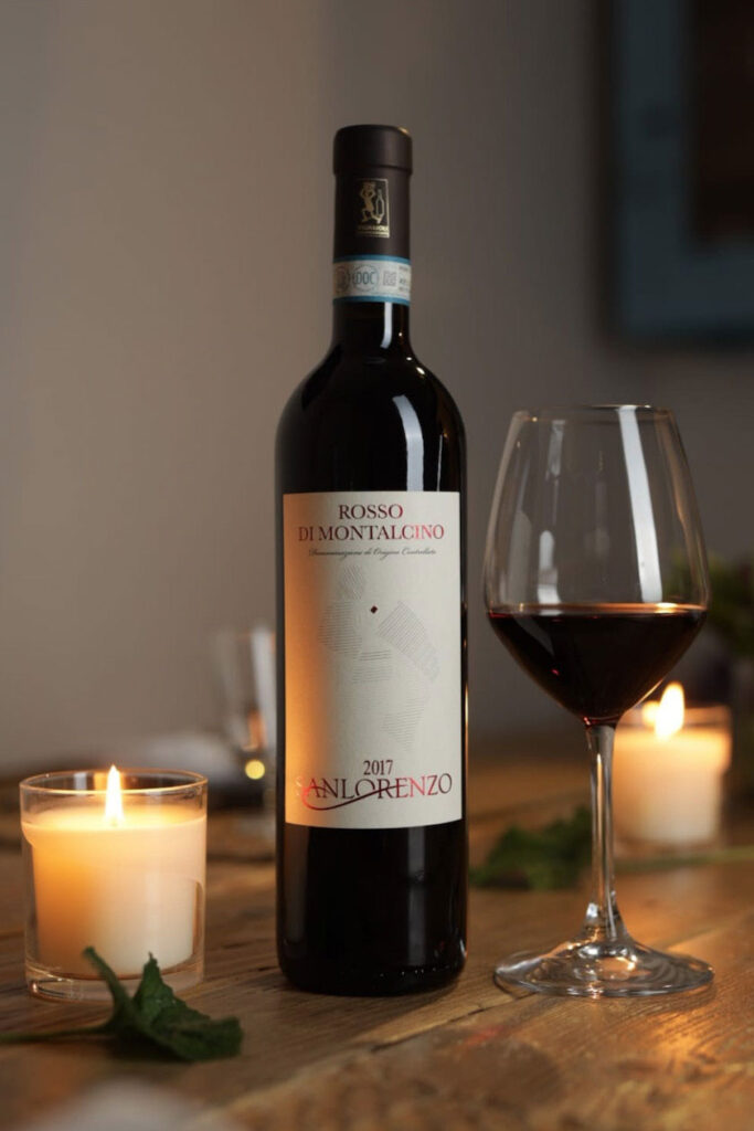
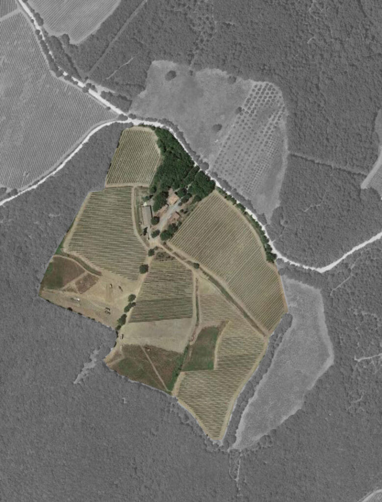
Sanlorenzo is a winery strongly rooted in the Montalcino territory, a producer of fine wines, exported all over the world, and managed by two brothers who have been running the winery together for years, personally “getting their hands dirty” to guarantee the perfect result of these very high quality wines.
The idea of creating a new label stems from the need to have a graphic line that in some way talks about the wine, the winery’s philosophy, what it is like to be part of such an important denomination and the craftsmanship of the product.
We started off by listening to the words of the owner Luciano Ciolfi, who told us the story of his winery, whereby progress over time is marked by planting new vineyards, which increase its wine production decade after decade.
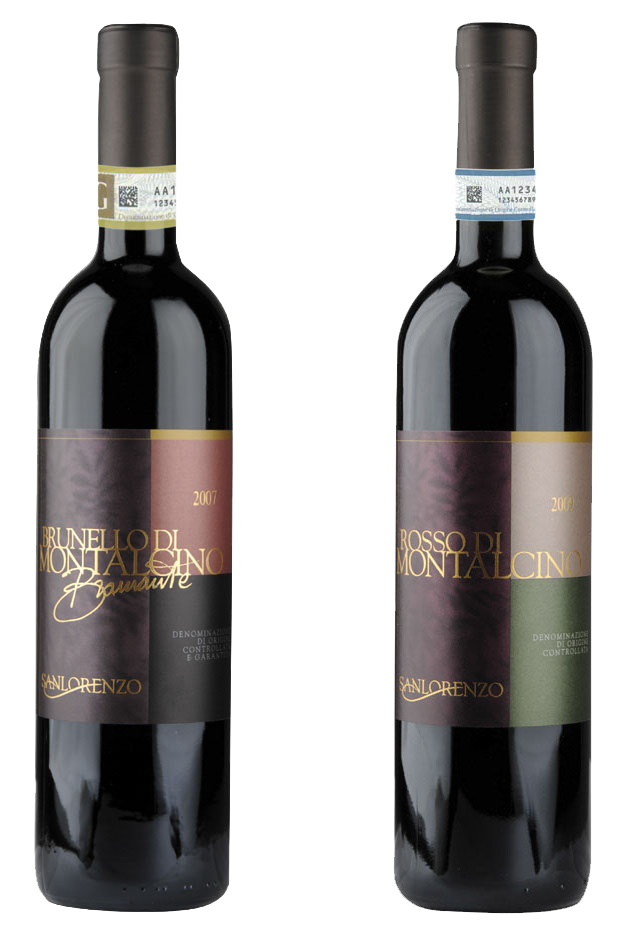
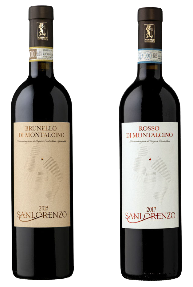
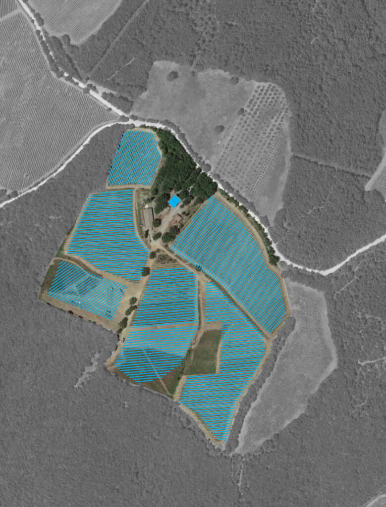
The wine comes from the soil, from the vines and from the hands of those who care for them month after month, season after season. We therefore decided that the true stars of the label should have been the vineyards, with the slope of their rows and stating their age, in order to tell the story of the winery after the vines were planted.Old Labels
New Labels
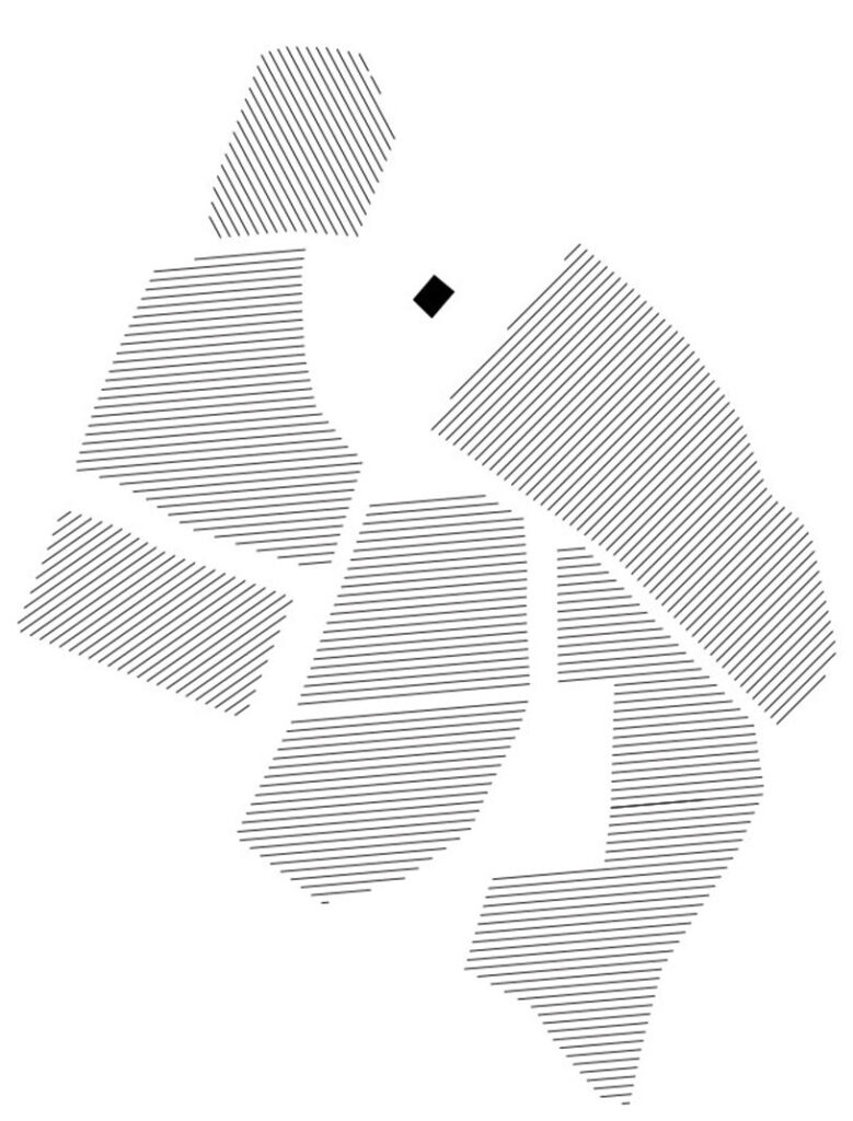
The Vines
Corporate Property
Highlighting the Vines
Extracting the Vines
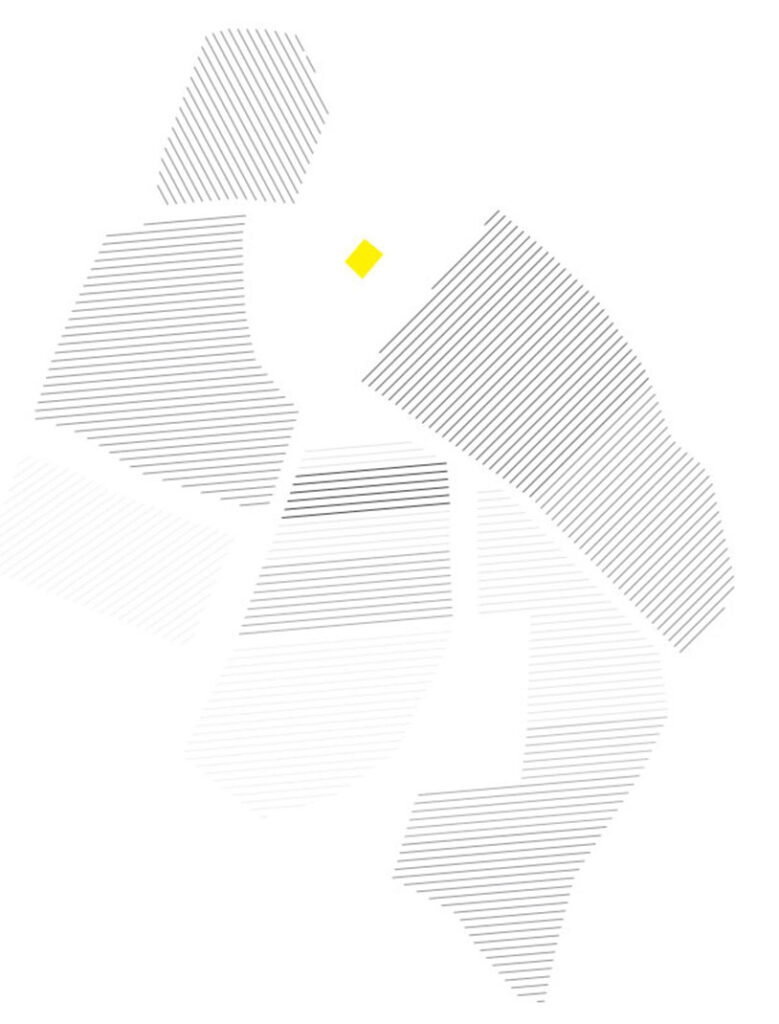
Colours depending on when planted
Social
![]()
![]()